Media guide: Producing farmer-friendly printed information
This media guide is covering the broad principles to be considered when developing printed material. Specific guidance will be developed for different sorts of printed development communication materials from posters to manuals.
In general, we suggest that all materials are designed and written for a particular locality and that they are adapted for use in other locations.
Media link: ASHC has developed a guide to generating messages using a write-shop approach
1 The technology: How to decide if the technology is appropriate for promotion
In development the mantra is ‘do no harm’. This means we need to ensure we work only with proven technologies.
Essential:
Will it make a difference?: Only promote technologies that are proven and cost effective with a realistic suggestion of what return on investment can be achieved. State the likely improvements, not the best possible outcome.
Desirable:
Winners and losers? When producing information, be sensitive to the impact of a technology on a farming family – not just on farm production but the unintended consequences (stover left in the field and therefore no longer used as cooking fuel can create a burden of collecting firewood].
Have a policy on brands: Text and photographs within the materials may single out particular brands of agricultural inputs. There is a danger that these brands could be seen as recommendations – rather than being indicative. The names of active ingredients in chemical products are very complex. In theory, listing them can help agro-dealers and farmers to get the right sort of inputs. In practice this is very hard. Partnering with private sector in-put manufacturers or suppliers to produce information materials can be a solution. In cases where inputs are required to make the technology work – the private sector is often the only long-term viable solution.
2 Have a plan or design brief
Essential: Brief encounters: Even when you are developing materials in-house, start with a clear brief. This should state:
Who are the materials for?
In most situations materials for farmers have to be kept simple and straight forward. Using simple words, short sentence and lots of diagrams and picture keeps them inclusive. There are different ways to segment farmers – by crop holding, by land tenure, by soil type, between rain-fed and irrigated; by age and sex, in terms of their access to market (subsistence / little market access; local/ regional market access and accessing international markets). The clearer you can be about which segments you should be aiming for, the easier it is establish appropriate messages.
Materials for extension staff follow similar rules to those for farmers – because they have to pass on farmer-friendly advice. However, extension teams are likely to appreciate some reference to the research and evidence about how and why the technology works.
Media Link 2.1: Segmentation of smallholder households
What is the function of the materials?
There are a number of different aims for communication materials. The function can be purely to raise awareness – in which case the messages need to focus on one or two core benefits. If the aim is to change attitudes then more information is needed – the materials really need to be validated by trusted sources, usually experts. If the aim is to change behaviour, then case study evidence is really helpful – seeing is believing!
What tone or look and feel are you looking for?
Materials can look and feel very different. They can be chatty and designed to appeal to youth culture; they can be peer to peer – farmers talking to farmers; they can be expert-led with strong evidence to support the technology. You may decide to create a house style for the project or technology. This will mean that this can be consistently applied to all your materials.
How do the new materials need to fit with existing materials? It is really useful to know what other materials have been developed by partners to try to ensure that technologies are consistent and to see if there are ways in which the style can be developed.
- What is the function of the materials – what change are you trying to bring about?
- What budget and in-kind support is available?
- How will you test the materials?
- Who has the final sign off of the design?
3 Have a plan: for distribution of your print
Essential
But where is it all going?: It is a REALLY good idea not produce a single piece of print until you have a dissemination plan in place. The nature of your relationship with the last mile agencies may also help you decide on the content.
Media link 3.1: Producing a media distribution plan
Standard formats for downloads: If you are producing material to be downloaded then you need to stick to standard formats and use images that can be reproduced in black and white as few organisations can afford colour printing. Look at these two versions of the same material produced by ASHC:
Media download 2.1: Coffee banana systems cropping guide A4 Black and white easy print version
Media download 2.2: Coffee banana systems cropping guide A5 full-colour needs digital printing and binding but is in a format that field teams liked
Gender on the agenda: Distribution plans can have a big impact on effective access to the information available to women and young farmers
Media download 2.3:Women in Extension film (web link) is a film that highlights the relationship between dissemination approaches and women
4 The economic justification
Essential
Support rational decision making – how will it make a difference: A clear cost-benefit analysis (even allowing for fluctuating commodity values) helps smallholders make rational decisions
Media link 3.1: Use appropriate images to demonstrate principles – here a poster makes a good point about storage but uses an image of a technology outside the reach of small-scale farmers
Clear comparisons: What happens with improved seed versus without, with organic material versus without.
State the downside: There is a risk associated with every technology and this must be spelt out – so that this can be factored in to the decision-making process.
Markets: Information on likely markets for surpluses – don’t recommend investment in scaling-up production if there is a risk that the market will be saturated or cannot be reached in a cost-efficient way.
Desirable
Incremental adoption: Materials need to help farmers to work out the likely costs of any set of recommendations and the implications of partial adoption because farmers cannot necessary go straight to full implementation
Media link 2.1: The OFRA approach allows farmers to build up investment until they have optimised their investment decision
5 Design
Essential
Step by step: Layout in a logical order and format – it is important the steps in the technology are clearly set out
Media link 4.1: Inoculation poster This photo-strip poster has 8 photographs in a logical order
Basic design rules: Printing to standard A size print is cheaper because there is no wastage. if you are producing booklets – the number of pages including the front and back cover should ideally divide by 4.
Stand out: You need to have strong colour contrasts so that text stands out. Visual impaired or older eyes need all the help they can get!
|
Tip 5.1: Colour contrasts – Here is a great tool to get you familiar with how changes to the background and text colour can work together. Whilst this tool is designed for web site design and uses Hex codes (not Pantones). The introduction to this web tool states: Finding the right color combination can take a design from “OK” to “amazing” pretty quickly, so it’s important to find colours that not only don’t clash, but bring out the best in each other. Enter Colorable the tool web and print designers can use to test out different colour combinations… |
Media link 5.2: We showed some materials to a group of people in Mozambique – they described the design as ‘funeral colours’. So, we embraced the use of brighter colours; yellow and blue replaced dull greens and browns.
Desirable
Catch the eye: Good design and strong use of colour
Placement: Clever placement of design elements can give you opportunities for better products. We could only afford to buy 3 pages in the Shujaaz comic to promote composting. So, we negotiated for a centre-page spread and a half page before and after.
Media link 5.3: Clever placement of the copy in Shujaaz meant we had effectively created a pullout poster on composting.
What’s the point (size) ?: Think about the size of the text (point size) and the function of the print – generally older people and people with lower literacy like larger print. If you are reversing out the print (light coloured writing on a dark background] you need to be careful with smaller fonts
Media link 5.4 & 5.5: Shujaaz Part of the reason why Shujaaz is successful is because the small format makes it hard for older people to read and this gives tell their parents about what they have read.
Readability: some type styles (called fonts) are easier to read than others.
Media link 5.6: Important type-faces There are two sorts of type-face: serif (like Garamond has serifs or embellishment on the letters) and sans-serif (like -: this is a straight sided crisp-looking type face). Having different type faces can help differentiate different text for example headings, body text and summary boxes could all be in different type faces. Large areas in italics or blocked capital are harder to read and should be avoided.
Look out for widows and orphans: A widow is a single word at the end of a paragraph that appears on its own. An orphan is a couple of words at the top of a new page that finish a sentence Media link 5.4: Widows and orphans explained
6 Text and language
Essential
Get the right language: In Ghana, ASHC was told ‘people who could read, could read English’ as well or better than they could read local languages. The partners decided print should be in English and radio and film should be in local languages.
Aim for easy to understand information so test your drafts with the target audience. William DuBay suggests that we need to adopt plain language, a literary style that is easy-to-read because it matches the reading skill of the audience. It is important to decide what farmers need to know – not show them how much we know. Look at everything you have written and ask yourself – so what do I expect a farmer to do with this information.
Media link 5.1: Keeping it simple – but ensuring it is accurate; the ISFM poster. When the ASHC team was set the task of making Integrated Soil Fertility Management more farmer-friendly it reworked ISFM into improved seed, fertilizer and manure. Feedback from the technical advisory group meant that this was changed to improved seed, fertilizer and more to allow for a more accurate representation of the technology. You won’t always get it right first time.
Media link 5.2: How not to present information to farmers on pesticide. There is a great deal of information that can be useful to farmers in relation to pesticides – this information is not amongst it! Think what do farmers need to know?
- Use farmer’s jargon, not scientific language – make sure you know the terms farmers actually use.
- Use short words and short sentences make it easier to follow instructions.
- Create a good relationship between text and images will mean you can write less text. It is usually easier to get shorter text if you can caption a series of image – rather try to edit down pre-existing material.
- Label all the diagrams and photos your use – they are for information not decoration.
- Keep in mind that children of the house may do the reading – where adult literacy is an issue – so this may influence your design or text.
- When you are planning your text work out what is essential to know – and what is desirable. The most important information should come first within each paragraph or section. This page has essential information, desirable information, tips and media links. This breaks up the text and, we hope, helps readers to focus on what they need to know!
|
Tip 5.1 What to prioritise! A good exercise for prioritising information is to give a group cards and say write down the 3 most important pieces of information. If you use different colours for 1,2 & 3 most important you not only get ideas you also get the ranking. From this exercise clusters of cards can be drawn together and information consolidated. Don’t just discard low scoring ideas – but bring them back to the group to make sure that any really good ideas can be captured – even if you can’t include everything! Tip 5.2 Clarity index tool gives a numeric score to text – based on the number of words in a sentence, the length of the words and the amount of punctuation applied. For example, the text above scores a clarity index of 21.4. The target score for text is 20-40. The word and sentence length is considered to be correct. The Gunning Fog index works but is harder to calculate – but the score relates to the educational level you need to attain to cope with the text. |
Desirable
Heads up: Develop a short snappy heading- that encapsulates the benefits to the farmer
Media link 5.1: Integrated rice manual [Heading: Good Rice -More Money: irrigated rice in Northern Ghana]
7 Images
Essential
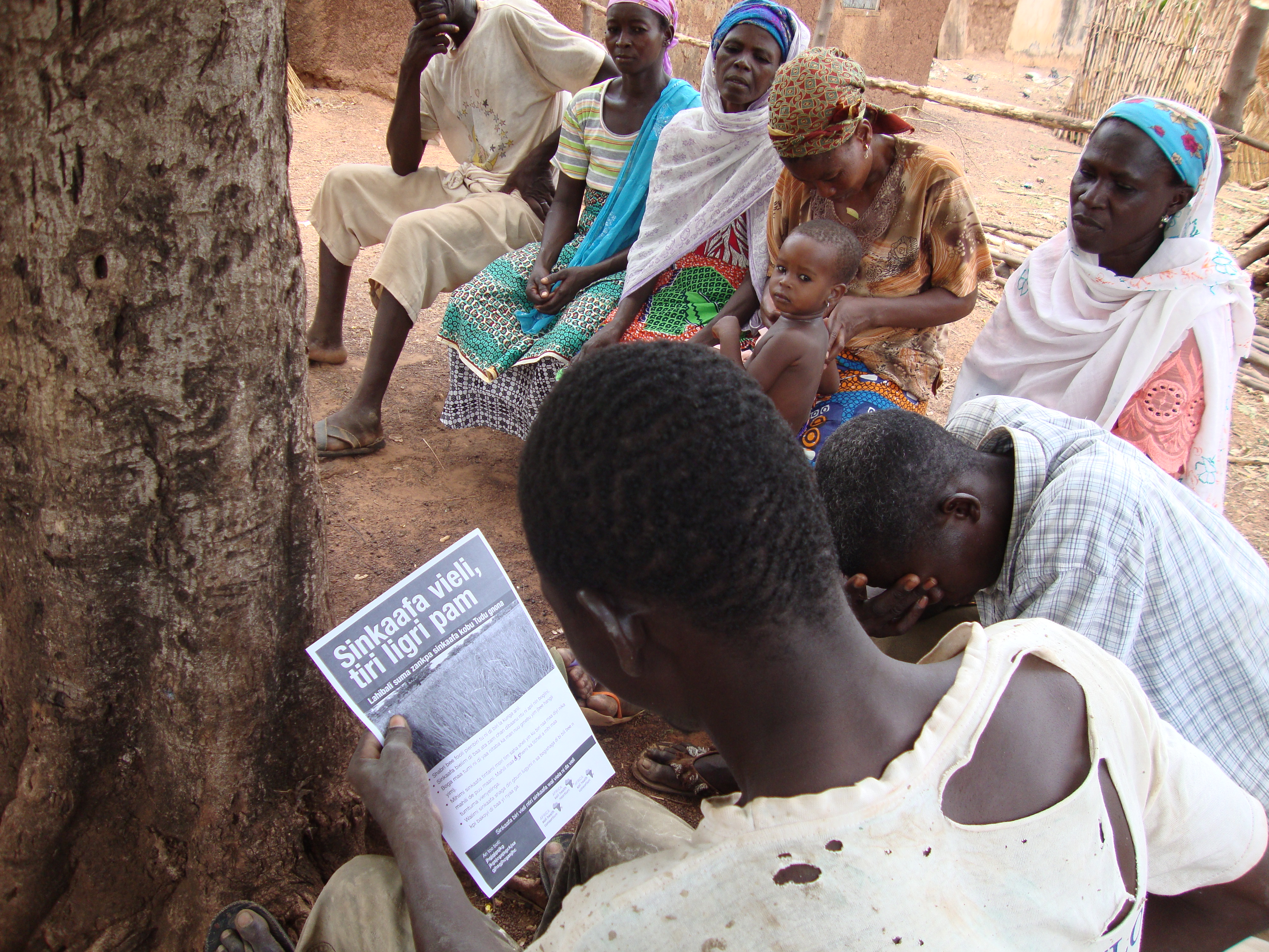
Step by step: Ensure that images reinforce all key processes that are recommended – images help lock in meaning for people who struggle to read.
Is that really a farm?: Getting the right photo for material can be hard. Photographs taken on a farm are much better than photos taken of research trials at research stations.
Desirable
Go compare: Clear comparisons – e.g. with improved seed and without, with organic material and without shown in photographs will be very persuasive.
Keep it real: Real photographs – reflecting real conditions – with named farmers in named locations appear to build confidence in the ideas being suggested.
8 Measurements
Farmers do not usually have standard measuring devices such as tape measures, or measuring cylinders.
Essential
Use of non-conventional methods to explain qualities and distances based on available and familiar items – in addition to conventional methods e.g. plant the maize an arm’s length (45 cm) apart.
Examples of non-conventional measurements:
- Body parts – hands legs
- 50kg fertilizer bags (the bags that the farmers actually used could contain up to 85kg of harvested maize)
- Coke/Fanta crown bottle-tops, matchboxes, margarine containers or water bottles
- Cutlass blades or other basic farm tools farmers.
- It is not considered good practice to use kitchen equipment for any agricultural practices
|
Tip 7.1 Calculating fertilizer usage: When making recommendations on fertilizer there are a series of challenges. Farmers and others find it hard to estimate the area of a field. Once they have estimated an area of a field, they find it hard to estimate how to apply the fertilizer at the right rate. It is often assumed that all fertilizer has the same density but there is a big variation such as 1.12 g/ml for single super phosphate to 2.22 g/ml for triple super phosphate Media link 7.1: Check out the fertilizer calibration tool (web link) to make sure that you get your farmer-friendly measurements correct! |
9 Gender
Ensure that the text and images reflect the differences in the way men and women work. For example, in making the ISFM introductory film, ASHC realised that women only usually had access to small animal manure – so more images of sheep and goats were included in the film. You may want to use the images to challenge gender stereotypes or highlight role models.
As well as selling any surpluses they have, women usually have primary responsibility for household food and nutrition security. This may mean that they farm in different ways. For example, they may harvest bean or cassava leaves to make meals more nutritious and interesting. These sorts of farming practices need to be researched and included into communication materials if they are to be inclusive.
10 Customisation
Why not… Leave white space for local customisation of the leaflet or poster so that the nearest agro-input dealers and extension service’s contact details can be written on the print. Instead of saying ‘contact your local agro-dealer’, leave a space for specific follow-up contacts to be added.