Media Guide: Making farmer-friendly posters
1 Introduction
Posters are a very popular communications tools. They are relatively cheap to produce at scale, and are very flexible in terms of the types of information they can convey, and they are also often free to display.
To help you to develop simple development communications posters the ASHC team has commissioned a simple poster template in PowerPoint. This mean that anyone can create a simple poster in a format that is acceptable to most printers.
This media guide will help you either:
- to use the ASHC templates to maximum effect
- or help you to develop a brief for a graphic designer and give you a basis for reviewing their work.
There is a growing move in development communications towards the co-creation of materials with target communities. This involves participatory processes with groups of farmers and intermediaries at key points in the materials development process. As a minimum you should validate your poster with both technical experts and the target audience.
The ASHC templates give clear opportunities to co-create short-runs of posters with specific communities responding to specific community needs and using locally generated images that talk to the local farmers. This guide will have some tips on co-creation of materials.
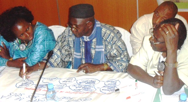
An ASHC write-shop to steer the production of a development communications poster
Posters usually contain a combination of text and graphics produced in a way that appeals to the target audience and portrays key information in a very immediate way.
The balance of text and images is a critical design decision you will need to resolve. When starting the design process, it is helpful to consider what the poster is setting out to achieve and how and where the poster is likely to be displayed. This will help you to arrive at a suitable format that is fit for purpose. This information will can be incorporated into the brief.
There are a number of different forms of poster used to share agricultural information in development communications:
- Promotional posters – that raise awareness of new agricultural techniques
- Reference posters – or look up tables that help farmers and intermediaries look up information e.g. which pesticide to use with which pest
- Training posters that set out step-by-step how to replicate a new agricultural approach
- Advocacy posters – that seek to change policy, regulation of the implementation of existing policy
- Conference posters used as the basis for delivering a session within a conference setting
|
Tip 1.1: This posters is part promotional, part reference and part advocacy. It was designed by ASHC to summarize a long report to funders. It combines information attached to around 15 different small graphics. Using the technique of visualization, makes dense and slightly boring information seem more vibrant and easier to remember. It breaks the data up into manageable chunks – if you have a lot of detail to share this sort of infographic can be a great way to share it. CABI was awarded the Africa Soil Health Project, in part, because of its ability to present complex data in easy to understand formats. It was important that the project displayed these competencies in it project communications and end of project report. The original of this graphic was developed by Grace Omondi, one of the CABI team, inspired by a graphic in Wallpaper magazine brought in by a colleague.
|
In addition there are a variety of different sorts of banners and billboards that follow similar design rules as poster.
The form of the poster will also be critical in the design process. A poster that is fighting for space in an agro-dealership is likely to be very different size and format to a poster designed to support a conference presentation, or be placed at demonstration plot.
This guide is mainly about supporting the development promotional and reference posters to meet the needs of African small-scale farmers.

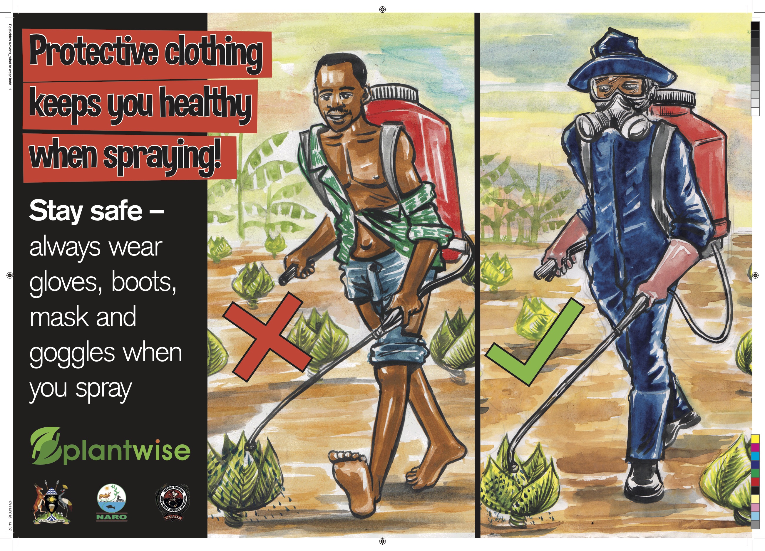
Left promoting ISFM (ASHC) and right promoting safe clothing in pesticide application (Plantwise)
The brief for this poster was to help a policy and practitioner audience better understand ISFM – integrated soil fertility management. The original design said Improved Seed + Fertilizer + Manure – but this was changed to more to be more inclusive of a range of practices including planting legumes or green manure.
When are promotional posters useful?
- To reinforce key messages of a campaign – such as one of the key benefits of a new technology
- To support messages on demonstration plots – linking the long-term messaging to what is going on in the plot
- Where there is an intermediary partner that can offer display space for posters – such as agro-dealers or farmer training centers
- Where a budget is in place for billboard or other roadside advertising
When are promotional posters not useful?
- For very complex messaging
- Where there is no clear idea about where the posters will be displayed
 .
.
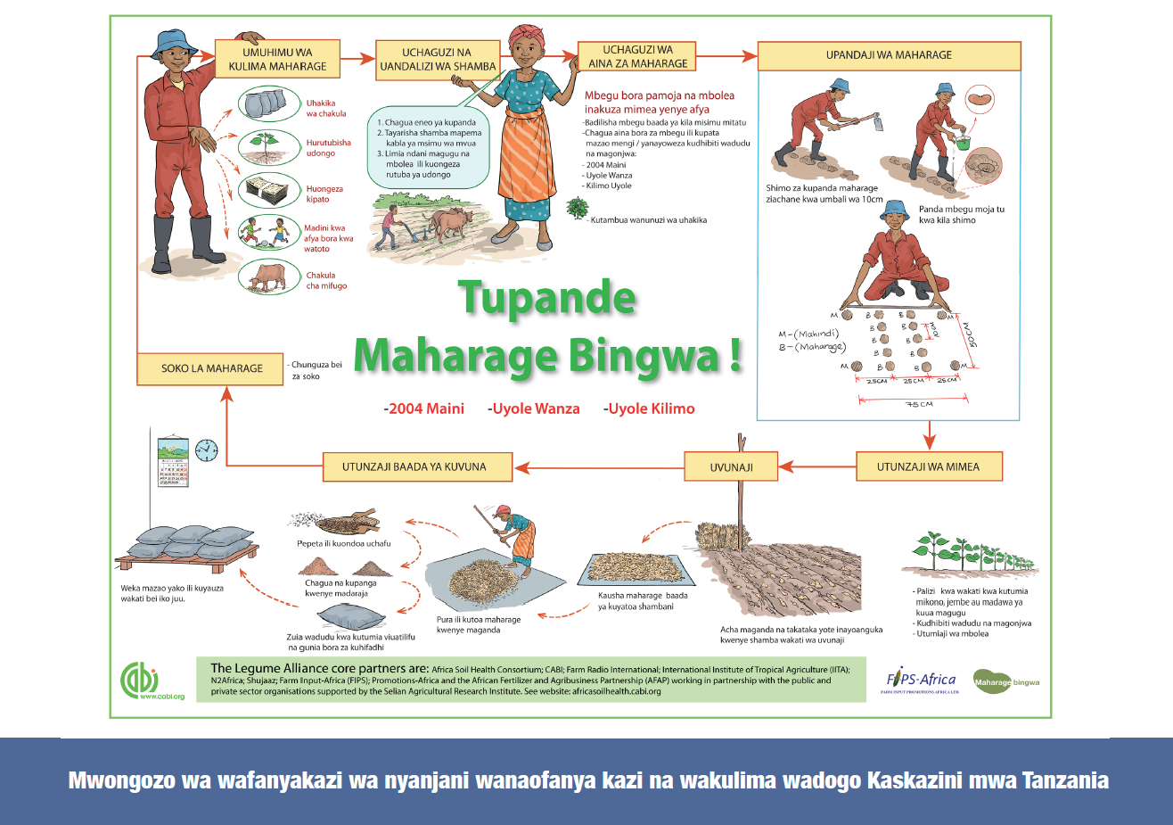
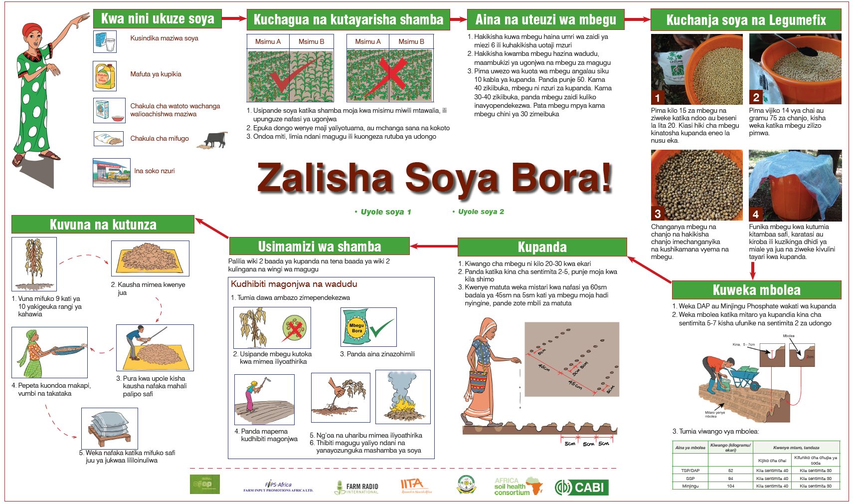
This reference poster was designed to be used as point of sale material in an agro-dealers but also a look up poster for the key stages for growing soybean. The information is presented as a landscape poster (long and flat) as this allowed more scope to show how farming is cyclical and end of season soil care can impact on the next seasons crop yields.
When are reference posters useful?
- When you have complex information to share which requires some looking-up of reference information
- When you are trying to empower farmers to make informed decisions
- When the posters can be displayed in an intermediary such as a agro-dealers or credit provider, so that intermediaries or farmers can use the posters to improve their decision-making
- When you are working with extension teams or farmer’s groups
 .
. 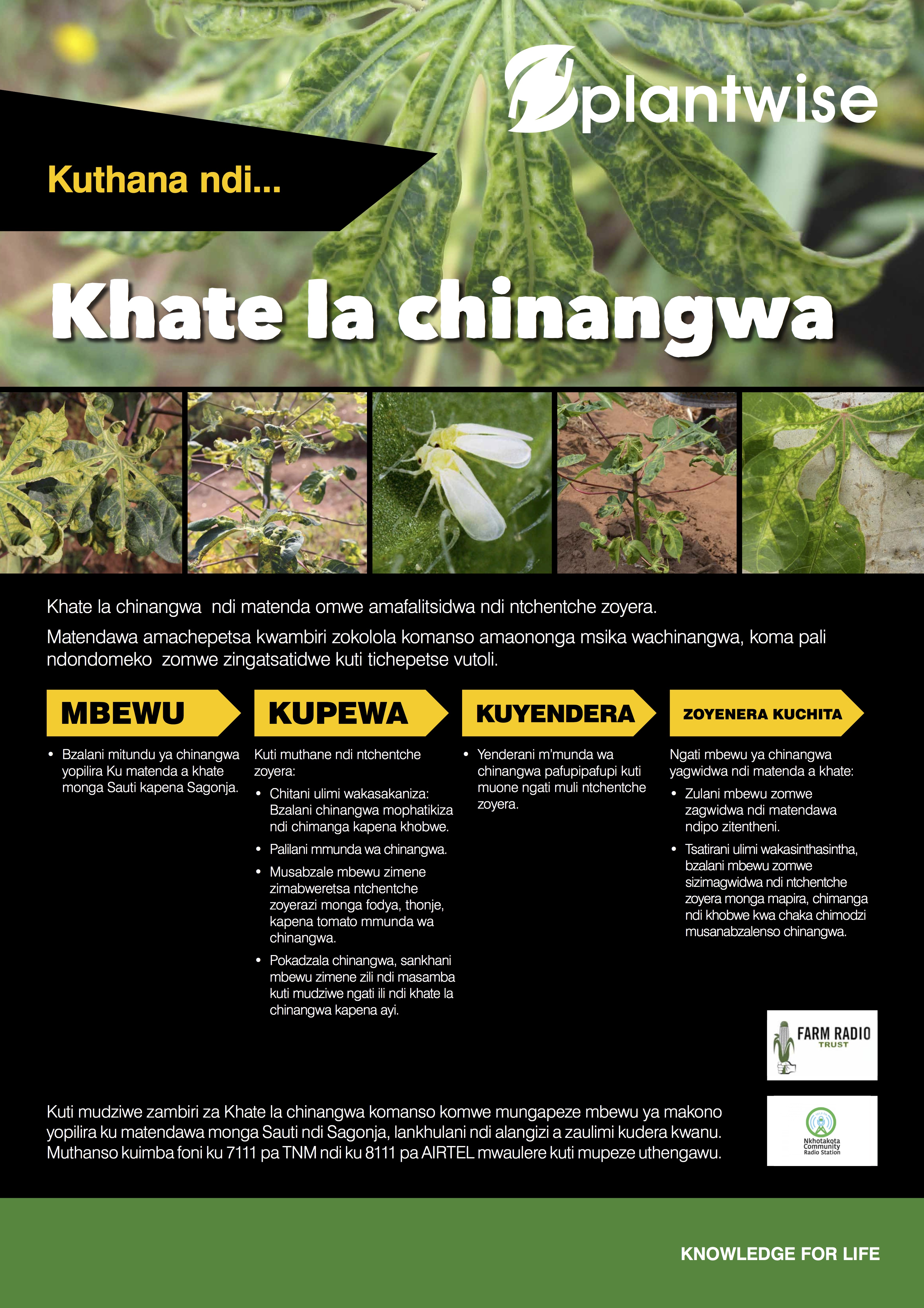
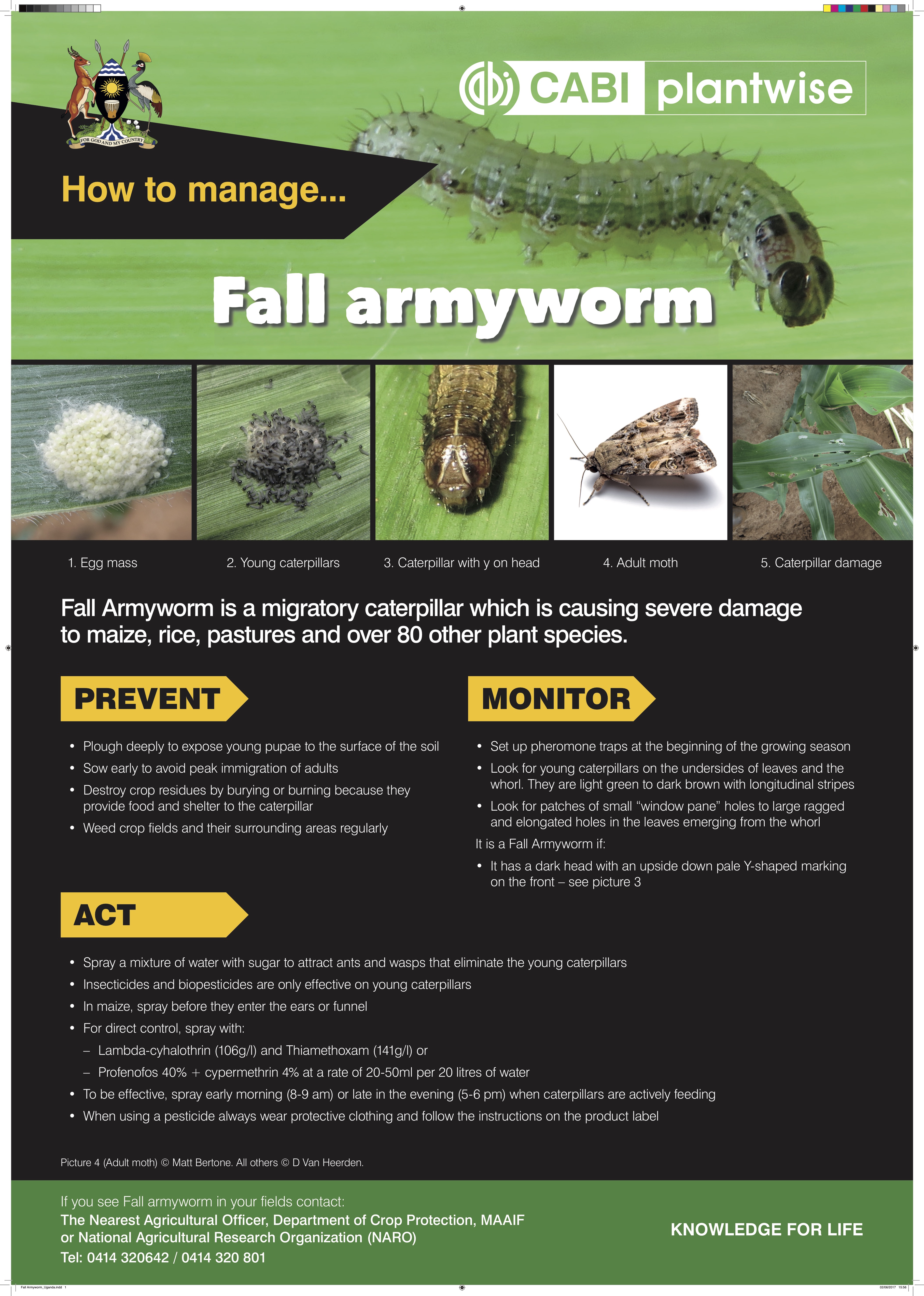
The reference poster left was designed as reference material for extension teams. Middle and right Plantwise reference poster explaining the identification and management of fall armyworm
When are reference posters not useful?
- When the posters are not / cannot easily be displayed in intermediary locations
- When training materials are needed because the graphics are too small for all but one-to-one advice clinics
Note: A companion guide will support the development of training posters and flip-charts and a helpful guide to conference posters has been developed by Liverpool University.
2 The technology checklist: How to decide if the technology is appropriate for promotion
In development the mantra is do no harm, this means we need to ensure we work only with proven technologies.
Will the technology make a difference to farmers?
- Only promote technologies that are proven and cost effective
- Promote a realistic suggestions of what return on investment can be achieved
- State the likely improvements, not the best possible outcome
- Ensure that you are honest about any risks associated with the technology.
Winners and losers?
- When producing information be sensitive to the impact of a technology on a farming family – not just on farm production but the unintended consequences (stover left in the field and therefore no longer used as cooking fuel can create a burden of collecting firewood.
- Will the technology create significant additional workloads – and if so are these likely to fall disproportionately to
Have a policy on brands – it’s complicated
- Text and photographs within the materials may single out particular brands of agricultural inputs. There was a danger that these brands would be seen as the recommendation – rather than being indicative.
- The names of active ingredients in chemical products are very complex. In theory listing them can help agro-dealers and farmers to get the right sort of inputs. In practice this is very hard. Partnering with private sector in-put manufacturers or suppliers to produce information materials can be a solution. In cases where inputs are required to make the technology work – the private sector is often the only long-term viable solution.
3 Brief encounters: Develop a brief for the poster
A brief is an outline document that guides the design of your poster it should cover the function of the poster, the look and feel of the poster, timing and budget. A brief is an essential document if you are commissioning a designer, but it is also useful when you are developing materials in-house.
3.1 Who are the materials for?
- In most situations posters for farmers should be kept simple and straight forward, using simple words, short sentence and lots of diagrams and picture keeps them inclusive. There are different ways to segment farmers – by crop holding, by land tenure, by soil type, between rain-fed and irrigated; by age and sex, in terms of their access to market (subsistence / little market access; local/ regional market access and accessing international markets). The clearer you can be about which segments you should be aiming for the easier it is establish appropriate messages.
- Poster for extension staff follow similar rules to those for farmers – because they have to pass on farmer-friendly advice. However, extension teams may need the images to be bigger and the text to be smaller to work as a teaching aid.
Media Link 3.1: Segmentation of Smallholder Households
- Is the audience likely to be literate? If so, what is the best language for written communication? In some cases the best language for written communication is different from verbal communication.
- Poster can be designed to work in a low literacy environment – there are even ways to make reference posters work through the use of symbols and the way that the text is organised. However, designing posters for a low-literacy environment is a challenge – because the audience is unlikely to be visually literate – they will be unused to many of the graphic conventions that are often employed in lieu of words.
3.2 What is the function of the materials?
- There are a number of different aims for communication materials. The function can be purely to raise awareness – in which case the messages need to focus on one or two core benefits. If the aim is to change attitudes then more information is needed – the materials really need to be validated by trusted sources usually experts. If the aim is to change behaviour, then case study evidence is really helpful seeing is believing!
The benefits selected here could have been phased differently. The features is that it will encourage nitrogen fixing. The benefit are:
- It provides the equivalent of 2 bags of free nitrogen which will boost cereal crops
- It will boost the soybean yield – especially if accompanied with the application of P fertilizer
- Stronger plans are more resilient in the face of many pests and diseases
3.3Where will the materials be displayed?
Where is the poster going to be displayed? This will help you decide on the size of the poster, the format. and how it will need to be designed to work/ stand out in this environment. There are increasing opportunities in Africa to rent billboard advertising space. These vary in size from 1m x 1.5 m to 12 m x 3m.
Posters designed to go into agro-dealerships to encourage farmers to buy inputs are known as point of sale materials. Other point of sale materials include promotional display stands or shelve edges, materials that hang from the ceiling or banners.
3.4 What tone or look and feel are you looking for?
- Material can look and feel very different. They can be chatty and designed to appeal to youth culture; they can be peer to peer – farmers talking to farmers; they can be expert-led with strong evidence to support the technology. You may decide to create a house style for the project or technology – this will mean that this can be consistently applied to all your materials.
3.5 Organizing a hierarchy of information
What information must the poster portray?
When you are thinking about making your poster you need to make tough decisions about what information to include and what to leave out. Posters have to be succinct.
Ensure your writing style is easy-to-read and matches the reading skill of the audience. It is important to decide what farmers need to know – not show them how much we know. Look at everything you have written and ask yourself –what do I expect a farmer to do with information?
It is a good idea to develop a hierarchy of information – identify essential, important and desirable information. From this you can think about the layout and flow.
| Essential information |
|
| important information |
|
| Desirable information |
|
Once you have clarified the hierarchy of information you can start to address the layout and flow of information. Think about whether it is a landscape of portrait format that will work best for your content. You should be thinking about the visuals that reinforce the hierarchy you are developing.
The Headline & sub-heading
The heading needs a short amount of text to grab the farmer’s interest. This probably relates to the benefit that is most relevant to farmers. For example:
Help meet the government targets on food security [which may be the aim of your project] versus Make more money growing soybean
Sometimes a heading can be split into two parts – with a second statement reinforcing the first – often in a smaller font. This is known as a sub-heading.
 .
.  .
.
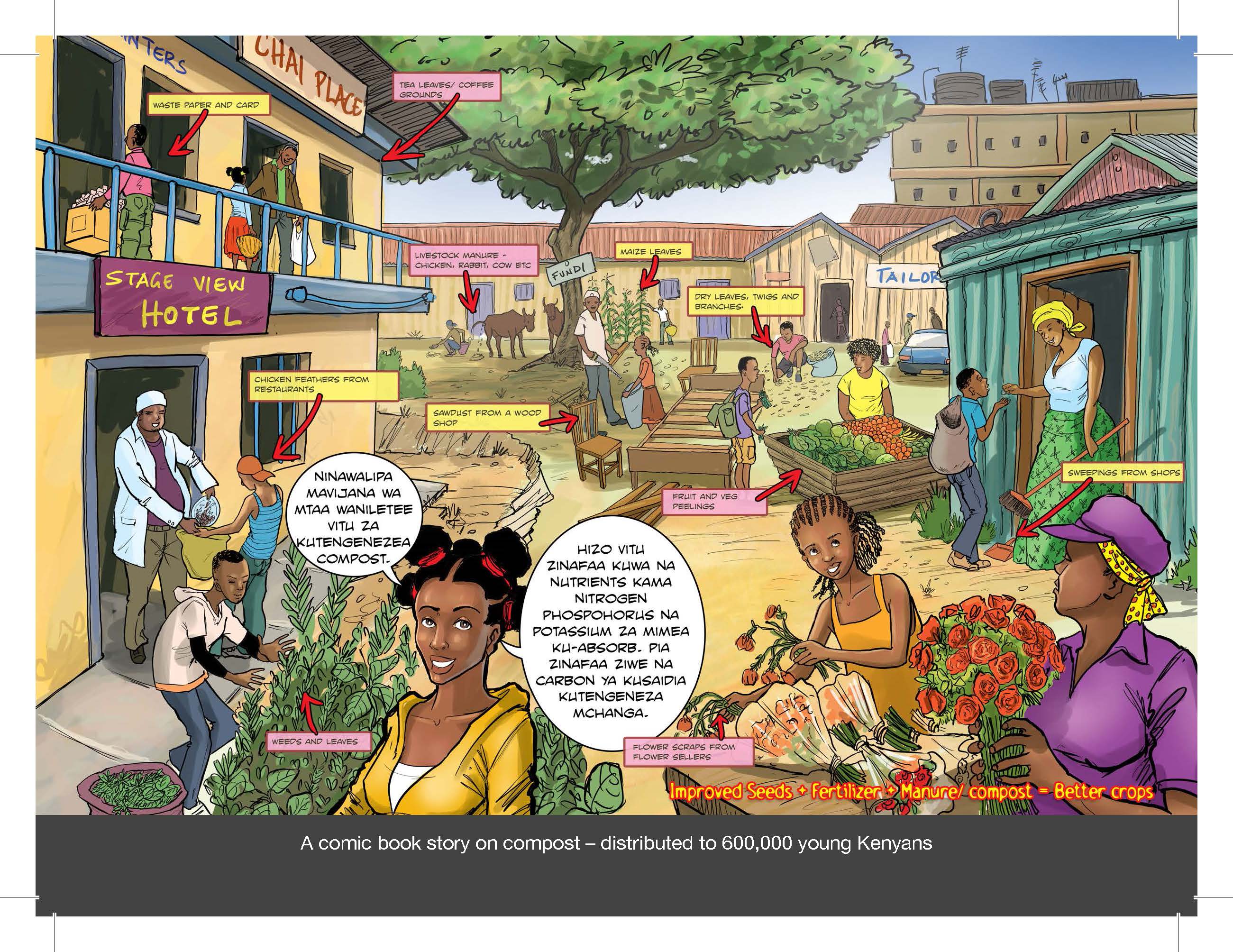
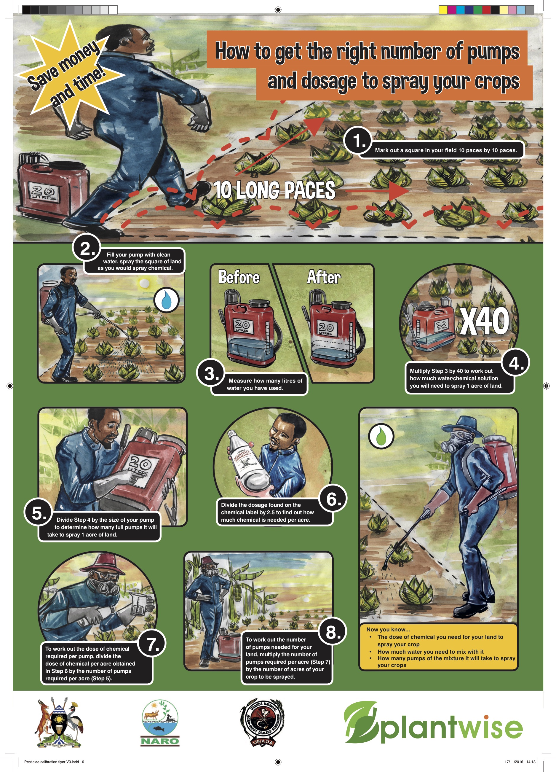
Four different design approaches: Top left a soybean poster produced by ASHC for the Clinton Foundation promoting soybean using a photograph and a clear heading and sub-heading showing the benefits of good agronomic practices and investing in inputs: Top left a pull-out poster from a Shujaaz magazine showing all the different sources of compost in one image – this is visually rich and complex and designed as part of a story in a comic; Bottom left a poster designed to help partners understand a multi-media campaign and how the different influences will impact on a farming family; Bottom right a Plantwise poster offering step-by-step guidance on getting the right application of pesticide.
Visual elements: The text size, placement, font and colour of the font can all be used to create emphasis for the headline or the sub-heading– and to make it stand out. The headline does not necessarily have to be at the top of the poster. It should be the largest type on the poster and it needs to be easy to read at the required distance.
The body text will be the place the essential and important information, noted in the table above, will be placed. Text needs to understandable but stripped back to be as few words as possible. Writing good, precise and succinct copy takes time hone and may require several drafts.
3.6 How do the new materials need to fit with existing materials?
It is really useful to know what other materials have been developed by partners to try to ensure that technologies are consistent and to see if there are ways in which the style can be developed.
- What is the function of the materials – what change are you trying to bring about?
- What budget and in-kind support is available?
- How will you test the materials?
- Who has the final sign off of the design
Clarity index |
|
| There is a way to ensure that the text (or copy) is written in short, punchy sentences. There is a tool that measures the clarity index of the copy http://www.neilstoolbox.com/clarity-index – this looks at the number of words, number of words over two-syllables and the amount of punctuation in a sentence. | The text in the left-hand box has a clarity index of 24.6. The tool said:This is about right. You have the right balance of word and sentence length. The target is to get between 20 and 40 in most communications |
Visual elements: The type size needs to contrast with the heading – about half the size can work well. You may decide to include some sub-headings to break-up the text. Another visual devise is the use of bullet points. These approaches can help to clarify the layout of the poster and flow of the information such that it places the emphasis where it is needed. This will help you to create blocks of information. The body text may be in a different font from the headline – or you may change the colour of the text to differentiate it. To create blocks of text that look good – you can adjust the spacing between letters (kerning) and lines (leading) this is important if you want to work with blocks of text as part of the overall design.
You will also want to start thinking about the photos and images that could reinforce the points you are making (see XX)
The required text should usually be the smallest element – this is information which is important to some stakeholders – but not important to the farmer in terms of their decision-making processes. This could include funder information for example.
Stress benefits not features
- Features are statements relating to the product specification – such as small white seeds
- Benefits stress what an agricultural technology can actually can do for the farmer – such as seeds resistant to Striga
- Benefits can also be show as comparisons – e.g. what happens with or without particular technologies being applied – this can help to show the benefits of a cluster of technologies
It is important that you are honest in the way that you present the benefits and that you select the benefits that are most important to the farmers
Some tips for talking to farmers:
- Use farmer’s jargon, not scientific language – make sure you know the terms farmers actually use
- Use short words and short sentences so that instructions are easier to follow
- Keep in mind that children of the house may do the reading – where adult literacy is an issue – so this may influence your design or text
Be clear about what you want the farmers to do – what is known as the call to action. In successful posters the call to action is clear, defined in simple terms, actionable (the farmers can actually do it!) and reinforced by all of the elements of the poster. It may be possible to create a call to action that will help you to get some indication of how successful your poster has been. For example, by working with local agro-dealers to see if farmers show an increase in demand for goods or services that support the technology you are promoting.
Images
The words and the images need to come together so that they create a coherent message for farmers.
Most posters include an image in some cases more images are used. These can be photographs or illustrations – or some combination of the two.
For promotional posters one strong image can be very effective if it reinforces the principle benefit you are trying to portray. Multiple images can be effective to show relationships between things or to create blocks of space for different text.
The images need to be easy to understand and be seen and understood at the required distance. Images can be close-up shots such as in input from the technology, or a farmer’s face. Or they can be wider shoots showing a more expansive scene such as a farmer with his cart laden with a harvest. Don’t forget that you don’t have to use a whole photograph – you may want to crop the photograph so that it really emphases the point that you want to make.
- Ensure that images reinforce all key processes that are recommended – images help lock in meaning for people who struggle to read.
- Getting the right photo for material can be hard. Photographs taken on a farm are much better than photos taken at research trials at research stations.
Farmers do not usually have standard measuring devices such as tape measures, or measuring cylinders. This means that you should consider including in your images non-conventional measuring techniques such as:
- Body parts – hands legs, fingers etc.
- 50kg fertilizer bags (the bags that the farmers actually used could contain up to 85kg of harvested maize)
- Coke/Fanta crown tops, match boxes, margarine containers or water bottles
- Cutlass blades or other basic farm tools farmers
OFRA Fertilizer Calibration Tool can help you design farmer-friendly measures for fertilizer application.
Text over images: Some designs have text layered on top of the image. If you do this, you will need to ensure that there is enough contrast between the background of the image and the text to ensure the text can be read. There are tricks to help – such as creating a shaped area over the image, behind the text or adding an outline around the words in a contrasting colour to help them to stand out.
Photographs versus images Including photographs of farmers will can achieve a number of things:
- It will quickly attract the attention of farmer
- In very localised campaigns the farmers may be recognised and this can build credulity and validate the message
- Photographs are also seen as real evidence that the technology you are promoting actually works.
Our experience is that people quickly notice if photographs are ‘not of people like them’ for example farmers in another country or region. Illustrations of farmers can be very effective as people appear to focus on the similarities to them. The cartoon characters in Shujaaz were drawn as four archetypal Kenyans – and yet young people across East Africa, and beyond, seem to identify with them.
Colour
The choice of colour is about more than a matter of taste. Colours mean different things in different context. We showed some materials to a group of people in Mozambique – they described the design as funeral colours. Some colours may be associated with political parties. Colours can create a sense of energy and attract the eye. Farming posters associated with the growing period are likely to have lots of green images – when they are associated with planting or harvesting more soil colours, or browns of dried crops will are likely to dominate.
Much of the print we see is black or dark text on white paper. Light text on a dark background can also be very readable and striking. Light text on a dark background is known as reversed out text. It can be challenging to read small print, or print with delicate serifs, which is reversed out.
The choice of colours in your poster will allow you to create contrasts that make the text stand out. This is an essential part of the design process. To help you to achieve a good colour contrast, use an on-line colour wheel such as www. paletton.com. This will present you with colour combinations that work effectively together.
Contrasting colours create impactful designs and they can make the text easier to read. Either side of the wheel are colours that have a strong contrast. By moving the line in the middle of the circle you can create more nuanced colour schemes which still make the text stand out.
Colours are described and categorized by pantones – this system helps you to accurately share ideas for colours with printers or designers and to ensure that colours stay consistent over subsequent print runs.
Test out several colour combinations for your poster design.
Headings
Colour can also be used to differentiate the heading from the body text.
Font types
Fonts are the name given to the different typefaces. There are dozens of different fonts loaded on to most word processing packages, so it is easy to experiment with them and find what you like. Play around with different fonts to create the look and feel you are after. You may want to try projecting your choice of fonts as a PowerPoint slide to get an idea of how it will work at the size you have planned and colour combinations you have planned.
Fonts fall into two families; serif and non-serif:
Popular serif fonts used in poster design include:
Popular sans fonts used in poster design include:
The fonts in the ASHC templates are Arial and Arial bold. The guidance notes say avoid adding in other fonts as it can complicate the piece and dilute your message. However, you may decide to mix fonts creating different points of interest. For example:
Headings and text
Headings and text can be in different fonts, in this case the heading is also in bold.
Italics should be used very sparingly on posters as they can be hard to read.
Font sizes
The size of the font will be dictated by:
- The space available on the paper size and format
- Where the poster needs to be seen from
- The amount of information that must be included
The relationship between the different elements of text – the headline and the body text are important. Usually the headline is at least twice as big as the text to give it prominence.
You can improve the design of a poster by allowing extra space:
- The process known as kerning allows you to increase the space between individual letters – conventional text spacing that looks great on a screen can seem blurred or distorted at a distance
- Between lines of text or between images and text – space can help make important features stand-out – you do not have to get things as big as possible to make them the focus of attention. This space between elements is sometimes referred to as negative space.
Generally older people, and people with lower literacy, like larger print.
Symbols
Symbols can be useful for getting over idea or grouping information – especially on reference posters. Symbols can convey a lot of complex information simply without the need for repetition.

3.7 Budget
| Design costs |
|
| Production costs |
|
| Distribution costs |
|
Production issues
Paper and other media
Printers are very knowledgeable about paper stocks that are available. The way that paper is described is in terms of grams per square metre (gsm) – 150 or 170gsm silk or gloss are popular choices for posters
Posters can be laminated or varnished to make them more robust. There are also materials other than paper – such as plastic or fabric which will add considerably to the costs of production but creates a poster that will last a very long time.
Standard sizes
Early in the design process you will have decided on the size the poster should be. Poster can be any size or shape you want. You may have identified that a particular use of the poster that will dictate a particular size and format.
If not, there are standard paper sizes based on ratios of each other – these standard poster sizes mean that there is no wasted paper in the printing process. These can be arranged as landscape (long and wide) or portrait (tall and narrow) formats.
Popular poster printing sizes are A2, A3 and A4. But if you want to have a square poster and that is the format you think will work best – go for it!
Standard paper sizes |
||
| Size | Width mm | Height mm |
| A0 | 841 | 1189 |
| B0 | 1000 | 1414 |
| A1 | 594 | 841 |
| B1 | 707 | 1000 |
| A2 | 420 | 594 |
| B2 | 500 | 707 |
| A3 | 297 | 420 |
| B4 | 353 | 500 |
| A4 | 210 | 297 |
| B4 | 250 | 353 |
Standard billboard size |
||
| Size | Width mm | Height mm |
| 4 sheet | 1016 | 1524 |
| 6 sheet | 1200 | 1800 |
| 12 sheet | 3048 | 1542 |
| 16 | 2031 | 3,048 |
| 32 | 4064 | 3,048 |
| 48 | 6096 | 3,048 |
| 64 | 8128 | 3.048 |
| 96 | 12,192 | 3,048 |